API Documentation
ifigures.InteractiveFigure(function, **kwargs)
Interactive Figure Object
Parameters:
-
function(Callable[..., (figure, str)]) –Callable function that returns matplotlib figure and caption and accepts same arguments as kwargs defined through Interactive Figure Input Controls
-
kwargs–keyword arguments that accept Interactive Figure input controls
saveStandaloneHTML(fileName, compress=False)
Saves interactive figure as stand alone HTML file
Parameters:
-
fileName(str) –test
-
compress(bool, default:False) –test. Defaults to False.
saveStaticFigure(fileName, values=None, figuresPerRow=2, labelPanels=True, dpi=300, labelSize=10, labelOffset=(10, 10), labelGenerator=None, compress=False)
Saves static figure as specified file
Parameters:
-
fileName(str) –filename with extension (e.g.
example.png). -
values(List[List], default:None) –List of Lists of arguments. For each one static panel will be created. If not specified will use all the values provided by the Input widgets.
-
figuresPerRow(int, default:2) –Number of panels per final figure row.
-
labelPanels(bool, default:True) –Should we label panels with
(a), (b), ... -
dpi(int, default:300) –resolution in dots per inch.
-
labelSize(int, default:10) –Label size for individual panels
-
labelOffset(tuple, default:(10, 10)) –Offset position of label.
-
labelGenerator(_type_, default:None) –description.
-
compress(bool, default:False) –Should we use pngquant to compress final figure.
show(width=800, height=700)
Shows static png or interactive html figure in Jupyter notebook
Parameters:
-
width(int, default:800) –IFrame width in pixels.
-
height(int, default:700) –IFrame height in pixels.
Returns:
-
–
IPython.display.IFrame: IFrame containing generated interactive figure
Why use interactive figure?
This is discussed in Physics World blogpost and comment. In short, we want to allow exploration of many untold stories and edge cases. To build intuition, connections and maybe get inspired for further work!
Simple interactive figure
from ifigures import InteractiveFigure, RangeWidget, RangeWidgetViridis, RadioWidget,DropDownWidget
import numpy as np
import matplotlib.pyplot as plt

def plot(amplitude, omega, time, color, f):
    fig, ax = plt.subplots(figsize=(8, 4))
    x = np.linspace(0, 10, 1000)
    if f=="sin":
        func = np.sin
    else:
        func = np.cos
    ax.plot(x, amplitude * func(omega*x), color=color,
            lw=5, alpha=0.4)
    ax.set_xlim(0, 10)
    ax.set_ylim(-1.1, 1.1)
    ax.set_xlabel(r"Time, $t$")
    ax.set_ylabel(r"$f(t)$")
    ax.set_title("Figure title. f(x) = amplitude * %s(omega*x)"
                % (f))
    ax.axvspan(time-0.1, time+0.1, color="0.9")

    caption = "Figure caption. Amplitude = %.2f, omega = %.2f, color = %s, f(t) = amplitude * %s(omega*x). Highlighted time = %.2f" % (amplitude, omega, color, f, time)
    return (fig, caption)


figure_example1 = InteractiveFigure(plot,
            amplitude=RangeWidget(0.1, 0.9, 0.4),
            omega=RangeWidget(1.0, 5.01, 2.0),
            time=RangeWidgetViridis(1,9,4),
            color=RadioWidget(['blue', 'green', 'red']),
            f=DropDownWidget(["sin","cos"]))
figure_example1.saveStandaloneHTML("interactive_figure.html")
Saving static version for printing
Even when we create interactive figures, sometimes we do need to provide also
printed option. This can be easily done with saveStaticFigure method, which
we demonstrate on the previous example
from ifigures import InteractiveFigure, RangeWidget, RangeWidgetViridis, RadioWidget,DropDownWidget
import numpy as np
import matplotlib.pyplot as plt

def plot(amplitude, omega, time, color, f):
    fig, ax = plt.subplots(figsize=(8, 4))
    x = np.linspace(0, 10, 1000)
    if f=="sin":
        func = np.sin
    else:
        func = np.cos
    ax.plot(x, amplitude * func(omega*x), color=color,
            lw=5, alpha=0.4)
    ax.set_xlim(0, 10)
    ax.set_ylim(-1.1, 1.1)
    ax.set_xlabel(r"Time, $t$")
    ax.set_ylabel(r"$f(t)$")
    ax.set_title("Figure title. f(x) = amplitude * %s(omega*x)"
                % (f))
    ax.axvspan(time-0.1, time+0.1, color="0.9")

    caption = "Figure caption. Amplitude = %.2f, omega = %.2f, color = %s, f(t) = amplitude * %s(omega*x). Highlighted time = %.2f" % (amplitude, omega, color, f, time)
    return (fig, caption)


figure_example1 = InteractiveFigure(plot,
            amplitude=RangeWidget(0.1, 0.9, 0.4),
            omega=RangeWidget(1.0, 5.01, 2.0),
            time=RangeWidgetViridis(1,9,4),
            color=RadioWidget(['blue', 'green', 'red']),
            f=DropDownWidget(["sin","cos"]))
figure_example1.saveStaticFigure("test.png",
                                [[0.5,1,1.5,"red","sin"],[0.5,3,1.6,"blue","sin"],
                                [0.5,1,1.5,"red","cos"],[0.5,3,1.6,"blue","cos"]])
print(figure_example1.overallCaption)
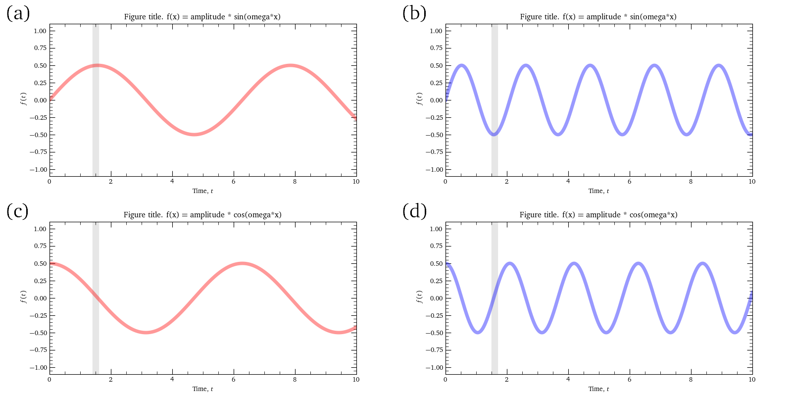
(a) Amplitude = 0.50, omega = 1.00, color = red, f(t) = amplitude * sin(omega*x). Highlighted time = 1.50, (b) Amplitude = 0.50, omega = 3.00, color = blue, f(t) = amplitude * sin(omega*x). Highlighted time = 1.60, (c) Amplitude = 0.50, omega = 1.00, color = red, f(t) = amplitude * cos(omega*x). Highlighted time = 1.50, (d) Amplitude = 0.50, omega = 3.00, color = blue, f(t) = amplitude * cos(omega*x). Highlighted time = 1.60
Input controls for interactive figures
Inputs for interactive figures are range sliders (including specially coloured RangeWidgetViridis that we use extensively to mark time evolution in dynamics), drop-down select boxes, and radio buttons, in some combination.
ifigures.RangeWidget(min, max, step=1, name=None, default=None, width=350, divclass=None, show_range=False)
Range (slider) widget
Parameters:
-
min(float) –starting value for input value range
-
max(float) –end value for input value range
-
step(float, default:1) –step size for input value range.
-
name(_type_, default:None) –description.
-
default(_type_, default:None) –description.
-
width(int, default:350) –description.
-
divclass(_type_, default:None) –description.
-
show_range(bool, default:False) –description.
Example: a static snapshot of input control widget

ifigures.RangeWidgetViridis(min, max, step=1, name=None, default=None, width=350, divclass=None, show_range=False)
Range (slider) widget that has viridis colourbar on background. Useful for special parameter, e.g. time.
Parameters:
-
min(float) –starting value for input value range
-
max(float) –end value for input value range
-
step(float, default:1) –step size for input value range.
-
name(_type_, default:None) –description.
-
default(_type_, default:None) –description.
-
width(int, default:350) –description.
-
divclass(_type_, default:None) –description.
-
show_range(bool, default:False) –description.
Example: a static snapshot of input control widget

ifigures.RadioWidget(values, name=None, labels=None, default=None, divclass=None, delimiter=' ')
Radio button widget
Parameters:
-
values(List[str]) –input option values
-
name(_type_, default:None) –description.
-
labels(List[str], default:None) –description.
-
default(_type_, default:None) –description.
-
divclass(_type_, default:None) –description.
-
delimiter(str, default:' ') –description. .
Raises:
-
ValueError–description
-
ValueError–description
Example: a static snapshot of input control widget

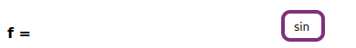
ifigures.DropDownWidget(values, name=None, labels=None, default=None, divclass=None, delimiter=' ')
Drop down widget.
Parameters:
-
values(List[type[str | float]]) –drop down option values
-
name(_type_, default:None) –description.
-
labels(List[str], default:None) –labels for drop down options. By default they are same as values.
-
default(_type_, default:None) –description.
-
divclass(_type_, default:None) –description.
-
delimiter(str, default:' ') –description.
Raises:
-
ValueError–description
-
ValueError–description
Example: a static snapshot of input control widget
Interactive timeline
ifigures.InteractiveTimeline(startYear=1900, endYear=2020, clickMarker=None, backgroundImage=None, title='', introText='<p><b>Interactive timeline</b>: To explore events <span class="interactivecolor"><b>click on circles</b></span>.</p>', introImage=None, introCredits='', compress=False)
Parameters:
-
compress(bool, default:False) –if True will try to compress all images uses pngquant. For this pngquant command on command line has to exist.
addEvent(year, title, text, image=None, credits='', offsetY=0)
Adds event to the timeline
Parameters:
-
year(int) –description
-
title(str) –description
-
text(str) –description
-
image(_type_, default:None) –description. Defaults to None.
-
credits(str, default:'') –description. Defaults to "".
-
offsetY(int, default:0) –description. Defaults to 0.
saveStandaloneHTML(fileName)
summary
Parameters:
-
fileName(str) –description
saveStaticFigure(folderName)
summary
Parameters:
-
folderName(str) –description
Why use timelines?
Scientific progress is huge community effort, often undertaken over many decades. Our timelines also have thickness since we recognize the importance of cross-breeding of ideas and insights from different "rivers" of thought and experimentation. Timeline format allows readers to explore and understand all the connection in historical development.
Timeline for development of electromagnetism
Annotation features for Matplotlib plots
ifigures.blobAnnotate(axis, blobX, blobY, textX, textY, text, blobSize=100, linewidth=3, fontsize=12, color=cDUbb, curvatureSign='+', zorder=-1)
Cartoon style blob annotation to highlight different parts of plot.
Parameters:
-
axis–figure axis where we do blob annotation
-
blobX(float)) –X position of blob highlight on axis
-
blobY(float)) –Y position of blob highlight on axis
-
textX(float)) –X position of corresponding annotation
-
textY(float)) –Y position of corresponding annotation
-
text(string)) –annotation
ifigures.xAnnotate(axis, fromX, toX, color=cDUy, zorder=-2)
summary
Parameters:
-
axis(_type_) –description
-
fromX(_type_) –description
-
toX(_type_) –description
-
color(_type_, default:cDUy) –description. Defaults to cDUy.
-
zorder(int, default:-2) –description. Defaults to -2.
ifigures.yAnnotate(axis, fromY, toY, color=cDUy, zorder=-2)
summary
Parameters:
-
axis(_type_) –description
-
fromY(_type_) –description
-
toY(_type_) –description
-
color(_type_, default:cDUy) –description. Defaults to cDUy.
-
zorder(int, default:-2) –description. Defaults to -2.
Example of annotations
import numpy as np
import matplotlib.pyplot as plt
from ifigures import *
from ifigures.style import *  # for color scheme

fig, ax=plt.subplots(1,1,figsize=(3*1.6, 3))

some_data = np.linspace(0,8,100)

ax.plot(some_data, some_data, "-", color=cDUb)
ax.plot(some_data, np.sqrt(some_data)+1.23, "-", color=cDUr)
xAnnotate(ax, 0.5, 5.5, color=cDUy)
blobAnnotate(ax,6,6, 6.5,1,"Nothing! $\Omega_2$", color=cDUggg)
blobAnnotate(ax,3,3, 4,1,"Something", color=cDUbb, blobSize=100)

plt.show()
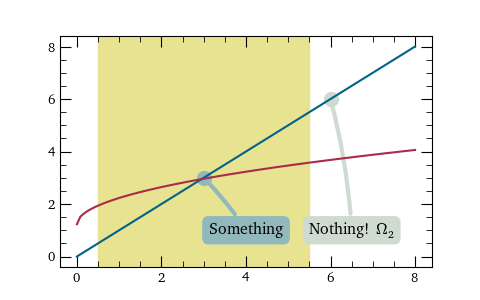
Why should one use annotations?
Modern figures in reserach papers are often dense with information, and presume substantial previous knowledge in order to be able to focus the sight on few actually relevant and interesting points. When working with interactive figures we are not bound to one "dead" version of plot on the paper, but can show multiple layers of annotations to help final knowledge consumers digest important features first, guiding their focus in interpretation gently. More widely, teaching plot literacy to wider population is crucial for informed decision-making.
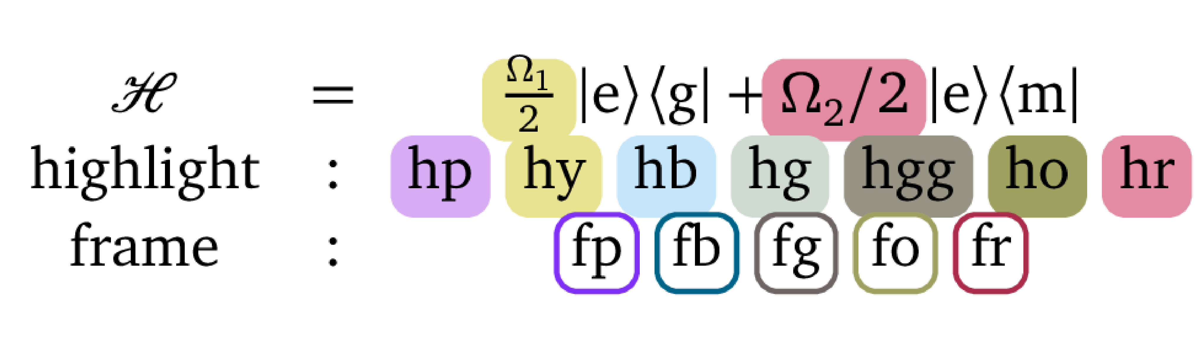
ifigures.equation(latex, axis, fontsize=10, dpi=100, border=[4, 4, 4, 4], debug=False, x=0.1, y=1)
Adds equations on the given axis plot (and turns off axis).
Parameters:
-
latex(_type_) –description
-
axis(_type_) –description
-
fontsize(int, default:10) –description. Defaults to 10.
-
dpi(int, default:100) –description. Defaults to 100.
-
border(list, default:[4, 4, 4, 4]) –description. Defaults to [4,4,4,4].
-
debug(bool, default:False) –description. Defaults to False.
-
x(float, default:0.1) –description. Defaults to 0.1.
-
y(int, default:1) –description. Defaults to 1.
Additional LaTeX commands
Some special commands are defined by default for use in equation environment
\ketbra{A,B}results in \(| A \rangle\langle B |\)\braket{A,B}results in \(\langle A | B \rangle\)- Highlighting: parts of equation can be higlighted in purple
\hp{...}, yellow\hy{...}, blue\hb{...}, gray\hg{...}, darker gray\hgg{...}, golden\ho{...}and red background\hr{...}. - Frames: parts of the equation can be framed in purple
fp{...}, blue\fb{...}, gray\fg{...}, golden\fg{...}, and redfr{...}frames.
Example of equation with additional LaTeX commands
import matplotlib.pyplot as plt
from ifigures import *

fig, ax=plt.subplots(1,1)

equation(r"""
$\begin{matrix} \mathcal{H} &=& \hy{\frac{\Omega_1}{2}}~ \ketbra{e}{g}  +\hr{ \Omega_2/2}~ \ketbra{e}{m} \\
\mathrm{highlight} &:& \hp{\textrm{hp}}~~~\hy{\textrm{hy}} ~~~\hb{\textrm{hb}} ~~~\hg{\textrm{hg}}
~~~\hgg{\textrm{hgg}} ~~~\ho{\textrm{ho}}~~~\hr{\textrm{hr}} \\
\mathrm{frame}& : & \fp{\textrm{fp}}~~~\fb{\textrm{fb}}~~~ \fg{\textrm{fg}}~~~\fo{\textrm{fo}} ~~~\fr{\textrm{fr}}  \end{matrix}$
""", ax,  fontsize=12, debug=False, x=0.5, y=0.5, dpi=300)

plt.show()
Quantum state visualisations
ifigures.getComplexColor(complexNo, maxAmplitude)
Get color for a complex numbers
Represents phase as continuous colour wheel, and amplitude as intensity of color (zero amplitude = white color), with linear mapping in between.
Parameters:
-
complexNo(complex float) –complex number
-
maxAmplitude(float) –maximum amplitude in the data set we want to represent as colour mapped dots. This is used for normalizing color intensity, going from maximal saturation or
maxAmplitudeto white color for zero amplitude.
Returns:
-
List[float]–List[float]: color as [red, green, blue, alpha]
Mapping complex numbers to colors
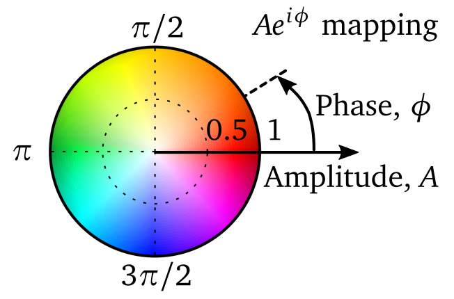 Mapping of complex number \(A e^{i \phi}\) with amplitude \(A\) and phase \(\phi\)
to colours used by the library.
Note that complementary colours correspond
to sign difference: green and red (like Italian flag), and yellow and blue.
In the case the amplitude is zero, all colours are linearly approching white
for amplitude \(A \rightarrow 0\).
Mapping of complex number \(A e^{i \phi}\) with amplitude \(A\) and phase \(\phi\)
to colours used by the library.
Note that complementary colours correspond
to sign difference: green and red (like Italian flag), and yellow and blue.
In the case the amplitude is zero, all colours are linearly approching white
for amplitude \(A \rightarrow 0\).
ifigures.BlochSphere(r=3, resolution=3)
Utilities for plotting Bloch Sphere
Parameters:
-
r(int, default:3) –description. Defaults to 3.
-
resolution(int, default:3) –description. Defaults to 3.
addStateArrow(x, y, z, color=cDUbbbb)
Adds state arrow to the Bloch sphere, given the tip position.
Parameters:
-
x(_type_) –description
-
y(_type_) –description
-
z(_type_) –description
-
color(_type_, default:cDUbbbb) –description. Defaults to cDUbbbb.
addStateBlob(x, y, z, color=cDUrr, radius=0.2)
Adds highlighted Blob on or inside the Bloch sphere.
Parameters:
-
x(_type_) –description
-
y(_type_) –description
-
z(_type_) –description
-
color(_type_, default:cDUrr) –description. Defaults to cDUrr.
-
radius(float, default:0.2) –description. Defaults to 0.2.
addTrajectory(trajectoryXYZ)
Adds trajectory in t, with t shown with viridis colouring.
Parameters:
-
trajectoryXYZ(_type_) –description
plot(axis=None, debug=False, cameraPosition=[(12.2, 4.0, 4.0), (0.0, 0.0, 0.0), (0.0, 0.0, 1)], labelAxis=True, labelSize=12, dpi=100, label=['$|g\\rangle$', '$|\\rm e\\rangle$', '$\\frac{|\\rm g\\rangle+|\\rm e\\rangle}{\\sqrt{2}}$', '$\\frac{|\\rm g\\rangle+i|\\rm e\\rangle}{\\sqrt{2}}$'], labelOffset=None)
Plots Bloch sphere on the given axis.
Parameters:
-
axis(_type_, default:None) –description. Defaults to None.
-
debug(bool, default:False) –description. Defaults to False.
-
cameraPosition(list, default:[(12.2, 4.0, 4.0), (0.0, 0.0, 0.0), (0.0, 0.0, 1)]) –description. Defaults to [(12.2, 4.0, 4.0), (0.0, 0.0, 0.0), (0.0, 0.0, 1)].
-
labelAxis(bool, default:True) –description. Defaults to True.
-
labelSize(int, default:12) –description. Defaults to 12.
-
dpi(int, default:100) –description. Defaults to 100.
-
label(list, default:['$|g\\rangle$', '$|\\rm e\\rangle$', '$\\frac{|\\rm g\\rangle+|\\rm e\\rangle}{\\sqrt{2}}$', '$\\frac{|\\rm g\\rangle+i|\\rm e\\rangle}{\\sqrt{2}}$']) –description. Defaults to [r"\(|e\rangle\)", r"\(|g\rangle\)", r"\(\frac{|e\rangle+|g\rangle}{\sqrt{2}}\)", r"\(\frac{|e\rangle+i|g\rangle}{\sqrt{2}}\)" ].
-
labelOffset(_type_, default:None) –description. Defaults to None.
Bloch sphere example
import numpy as np
import matplotlib.pyplot as plt
from ifigures.amoplots import *

from scipy.linalg import kron, eig


a = np.linspace(0,8,100)

f = plt.figure(figsize=(6,8))

ax1 = plt.subplot(1,1,1)

def trajectory(gi):
    G=gi*2.0 #input parameter
    Omega=10.0
    Delta=10.0
    phiL=0.1*np.pi/2
    H=np.array([[Delta/2, (Omega/2)*np.exp(-1.j*phiL)],[(Omega/2)*np.exp(1.j*phiL), -Delta/2] ])
    I2=np.eye(2,2)
    Hrho=kron(H,I2)
    rhoH=kron(I2,np.conj(H))
    L=np.array([[0,0,0,G],[0,-G/2,0,0],[0,0,-G/2,0],[0,0,0,-G] ])
    evals, evecs = eig(-1.j*(Hrho-rhoH)+L)
    evecs=np.mat(evecs)
    rho0=np.zeros((4,1))
    rho0[0]=1.0
    npts=50
    tmax=2*np.pi/np.sqrt(Omega**2+Delta**2)
    t=np.linspace(0,tmax,npts)
    u=np.zeros(npts)
    v=np.zeros(npts)
    w=np.zeros(npts)
    for i in range(0,npts):
        rho=evecs*np.mat(np.diag(np.exp(evals*t[i])))*np.linalg.inv(evecs)*rho0
        u[i]=(rho[1]+rho[2]).real
        v[i]=(1.j*(rho[1]-rho[2])).real
        w[i]=(rho[0]-rho[3]).real
    return np.column_stack((u, v, w))

bs = BlochSphere()
bs.addStateBlob(0,0,1)
dynamics = trajectory(3)
bs.addTrajectory(dynamics)
bs.addStateBlob(0,0,1)
bs.addStateBlob(*dynamics[-1,:])
bs.addStateArrow(*dynamics[-1,:],)
bs.plot(axis=ax1)
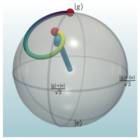
Example above shows Bloch sphere, with annotated key points of the sphere, state trajectory in time shown as line with time encoded in viridis gradient, state arrow, and two blobs highlighting in this case start and end of the evolution. We also notice how trajectory of the system departs the surface of the Bloch sphere and dives into inside due to decoherence. Note that actual Bloch sphere plot is only last few lines of code, the rest is calculation of dynamics.
ifigures.DensityMatrix(with_grid=True)
Color mapping of Density Matrix
Parameters:
-
with_grid(bool, default:True) –description. Defaults to True.
plot(axis, rho, visualise='with dots')
summary
Parameters:
-
axis(axis) –description
-
rho(_type_) –description
-
visualise(str, default:'with dots') –description. Defaults to "with dots".
Densitry matrix visualisation
import matplotlib.pyplot as plt
from ifigures.amoplots import *

fig, ax=plt.subplots(1,1,figsize=(3, 3))

dm = DensityMatrix()
dm.plot(ax, [[1/2, 1j/2], [-1j/2, -1/2]])

plt.show()
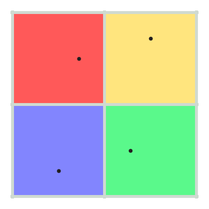
Why use coloured density matrixes
They are capable of quickly conveying numerical results, arguably providing better grasp of underlying physics than 3D bar charts. And of course they work for multi-level systems.
ifigures.EnergyLevels()
Generates energy level diagram with annotation.
add(label, locationX, locationY, color='k')
Adds energy level
Parameters:
-
label(str) –label of the energy level
-
locationX(float) –center position on plot axis
-
locationY(float) –center position on plot axis
addArrow(fromStateIndex, toStateIndex, label='', style='<->', color='k', strength=1, detuning=None)
Adds arrow to the energy level diagram.
Parameters:
-
fromStateIndex(int) –index of the first state
-
toStateIndex(int) –index of the second state it points to
-
style(string, default:'<->') –style of arrow, accepted values are '<-', '->' or '<->' . Default is '<->'
-
detuning(float, default:None) –None by default. Or (relativeValue, "label") tuple
clearState()
Clears system state from the energy level diagram.
getTotalStates()
Total number of states on the energy level diagram.
plot(axis, labels=True, linewidth=4, length=0.7, stateBlob=500, fontsize=14, arrowLabelSize=12, debug=False, dpi=100, drivingStrenghtToWidth=True, couplingBlob=0.3)
Plots energy level digram on the given figure axis.
Parameters:
-
linewidth(float, default:4) –energy level line width
-
length(float, default:0.7) –energy level line length
-
stateBlob(flaot, default:500) –maximum blob size for a system state, corresponding to the unit amplitude for the system to be in a given energy level
-
drivingStrenghtToWidth(bool, default:True) –Should arrows correspond to driving strengths. True by default.
-
debug(bool, default:False) –turns on and of plot axis, useful for precise positioning.
setState(state)
Adds current state representation to level diagram.
State will be represented as blobs of different sizes and colors plotted on corresponding energy levels. Blobs size correspond to the amplitude of that basis state in the total state, while their colour is mapped based on the complex colour wheel scheme defined in my_plots.
Parameters:
-
state–complex number array decomposing state in the basis of the previously added energy levels
Example
import matplotlib.pyplot as plt
import numpy as np
from ifigures import *
from ifigures.style import *

fig, ax1=plt.subplots(1, 1, figsize=(3 * 1.6, 3))

# Hamiltonian - driving
omega_1 = np.pi/1.5
omega_2 = np.pi * np.exp(1j * 0.5 * np.pi)

# Current state in the basis defined in order given below
state = [1/np.sqrt(2), -1j/2, -1/2]

el = EnergyLevels()
# basis - energy levels and their relative positions
el.add(r"$|\mathrm{g}\rangle$", 0, 0)    # |g>
el.add(r"$|\mathrm{m}\rangle$", 1, 2.9)  # |m>
el.add(r"$|\mathrm{e}\rangle$", 2, 0.2)  # |e>

el.addArrow(0,1,"",
            strength=omega_1,
            style="<->", color="red")
el.addArrow(1,2,"",
            strength=omega_2,
            style="<->")

el.setState([1/np.sqrt(2), -1j/2,-1/2])

el.plot(ax1)


plt.savefig("test1.png")
plt.show()
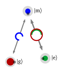
- State blob with color and size correspond to phase and amplitude
- small gray dot on the blobs indicates phasor tip, to allow also for colour blind readout
- external arches correspond to rotation of the small amplitude contribution for amplitude going from lower to higher states, while inner circles arches correspond to rotation of the small amplitude contribution from higher states to lower states.
- diameter of arched driving connection, and strength of the corresponding arrow, for the drivings is proportional to relative strengths of driving.
Why use this new energy level and state representation
It can show features even in 2 level systems that are not visible on Bloch sphere. Equally it can be generalized to many level and multi-partite systems directly. Representation is such that it allows "visual integration" of coherent dynamics. E.g. it is possible to directly see not only destructive interference responsible for Electromagnetically Induced Transparency, but also understand importance of laser phase. For many examples check the An Interactive Guide to Quantum Optics, Nikola Šibalić and C Stuart Adams, IOP Publishing (2024)